
20 Tea Party Food Presentation Ideas That Turn a Simple Spread Into an Occasion
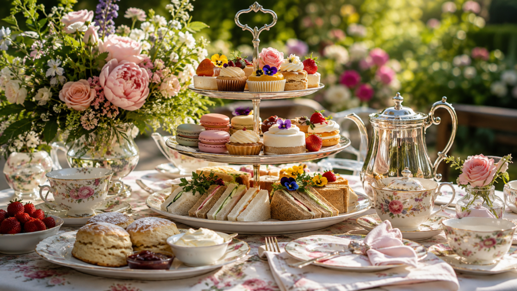
There’s a moment at every good tea party when someone leans over the table, looks at the tiered stand, and says “oh, how pretty” before they’ve eaten a single bite. That reaction isn’t an accident. It comes from presentation choices made well before the first pot of tea is poured.
You don’t need a catering budget or professional styling experience to get there. You need a few reliable techniques, a sense of color and height, and a willingness to plan the table the way you’d plan an outfit pieces that work together, not just pieces that are pretty on their own.
Here are 20 tea party food presentation ideas, organized from foundational to advanced, to help you build a tea party spread people remember.
1. Build Height With a Tiered Stand
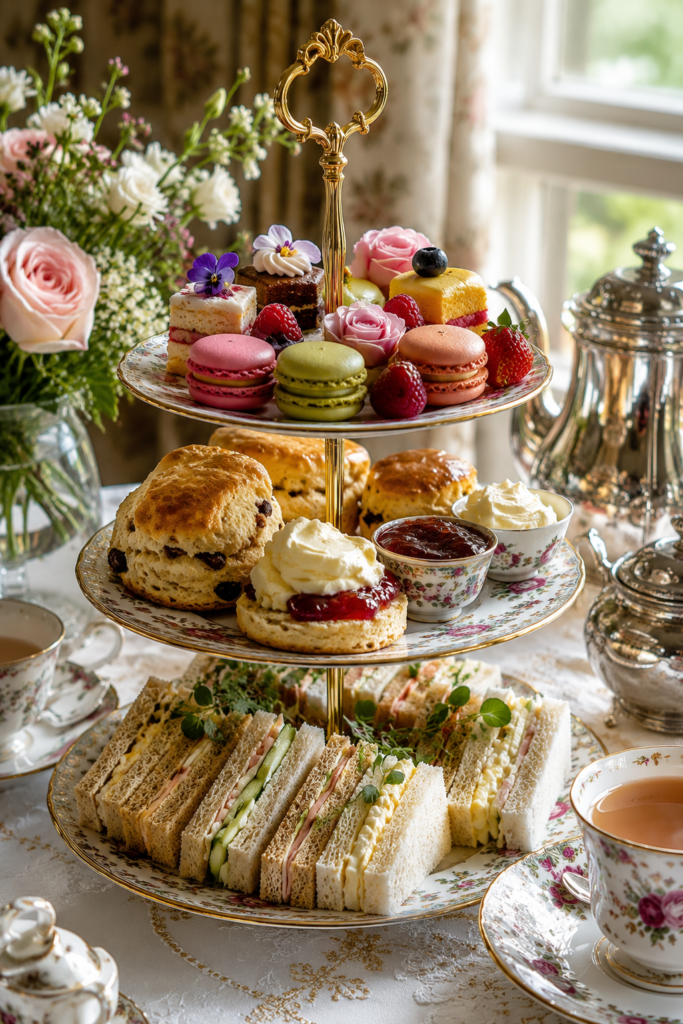
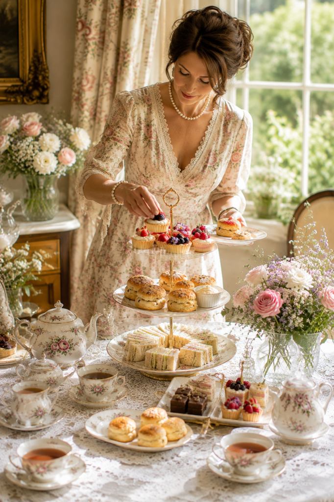
A three-tier stand is the classic tea party centerpiece for a reason: it does the visual work of a much larger table in a fraction of the footprint. The traditional order runs savory on the bottom, scones in the middle, sweets on top, but don’t feel locked into that if your menu doesn’t fit it. What matters more is the rhythm it creates — the eye travels up, then across, then up again, which is far more interesting than a flat table where everything competes for attention at the same level.
If you don’t own a stand, cake plates of graduating sizes stacked with cardboard risers between them (wrapped in fabric or paper so nothing shows) achieve the same effect for almost no cost.
2. Use Odd Numbers for Arranged Items
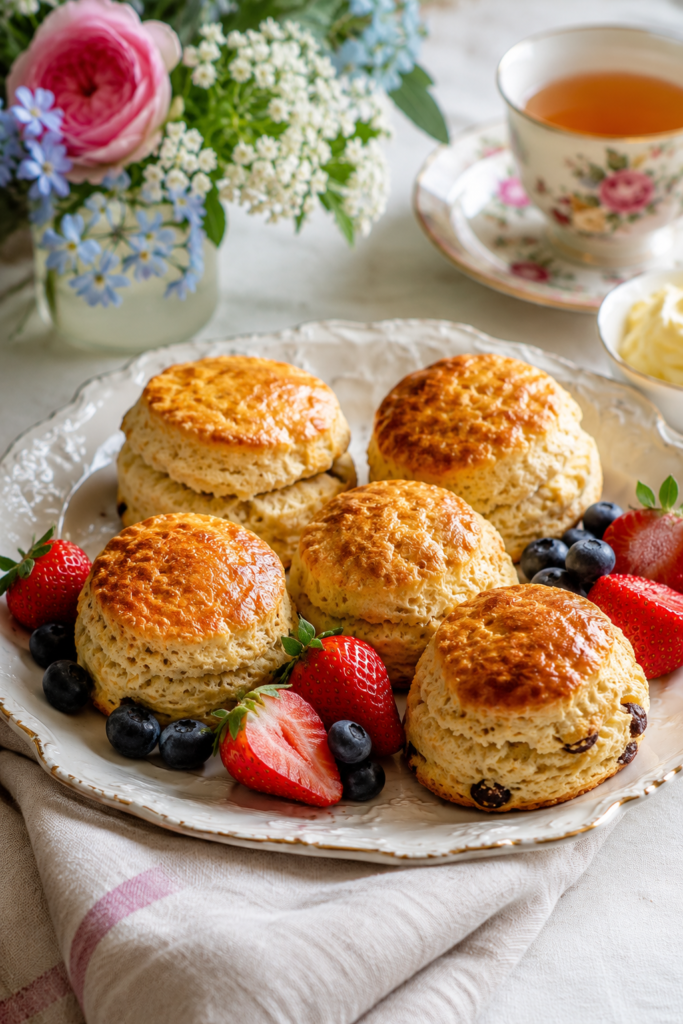
Three scones look intentional. Four look like a countable inventory. This is a basic principle of visual design — odd numbers read as arranged, even numbers read as measured — and it applies directly to how you plate sandwiches, macarons, or petit fours. Group items in threes or fives rather than even, symmetrical rows.
3. Color-Block the Sandwich Tray
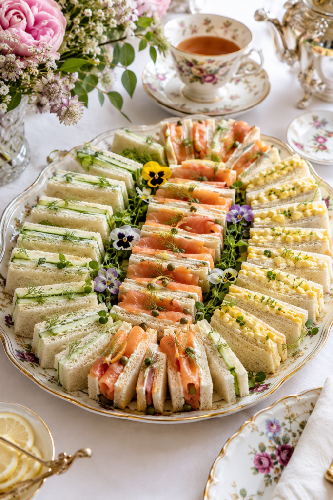
Finger sandwiches are often the least visually interesting part of the spread because the filling is hidden. Fix this by grouping sandwiches by color rather than by type — all the cucumber-and-cream-cheese together, all the smoked salmon together, all the egg salad together — so the tray reads as bands of pale green, coral pink, and pale yellow instead of a mixed pile. It also makes the tray easier for guests to navigate if they have preferences or allergies.
4. Cut Sandwiches Into More Than One Shape
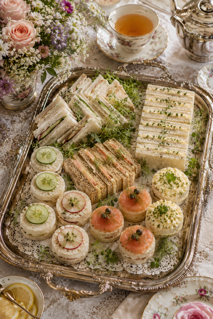
A tray of identical triangles is fine. A tray with a mix of triangles, small rounds (cut with a biscuit cutter), and delicate fingers is more dynamic and signals more effort without any extra ingredients. Vary the cut, not just the filling.
5. Give Each Sweet Its Own Small Plate or Doily
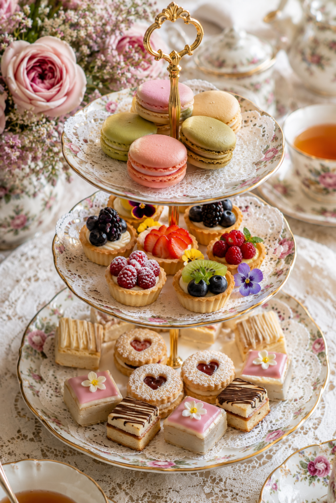
Instead of piling every dessert onto one tier, use small individual plates or paper doilies to separate categories — macarons on one, mini tarts on another, shortbread on a third. This creates visual “rooms” within the larger table and stops the sweets from blurring into a single mass of sugar and color.
6. Anchor the Table With a Low, Wide Floral Arrangement
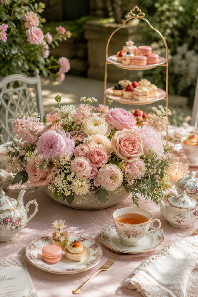
Tall centerpieces block sightlines across a tea table, which matters more here than at a standard dinner table because conversation and passing dishes both happen at close range. A low, wide arrangement — even a shallow bowl of a single flower type, like ranunculus or garden roses — adds color without getting in the way.
7. Match Teaware to a Single Accent Color, Not the Whole Palette
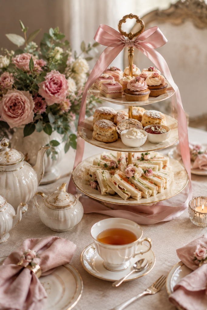
A common mistake is trying to color-coordinate everything: linens, flowers, cake, and cups all in the same shade. It reads as costume rather than table. Instead, pick one accent color (a dusty rose, a sage green) and let it appear in two or three places — the ribbon on the stand, the napkins, the icing on one dessert — while everything else stays neutral. Restraint reads as more expensive than matching.
8. Use Edible Flowers as Garnish, Not Decoration
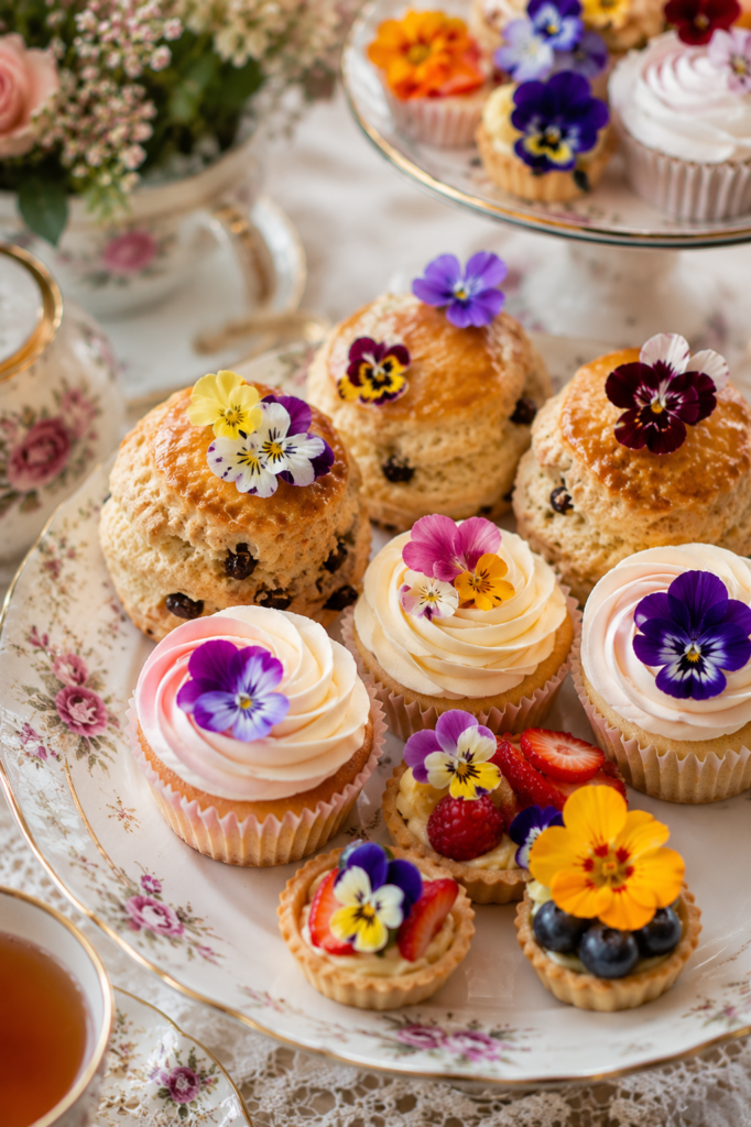
Pansies, violas, and nasturtiums are food-safe and photograph beautifully on scones, cakes, and even sandwiches. The key is using them sparingly — one small bloom per item, not scattered handfuls — so they read as a deliberate garnish rather than confetti. Always confirm flowers are pesticide-free and specifically grown for consumption before serving.
9. Dust, Don’t Drown, With Powdered Sugar
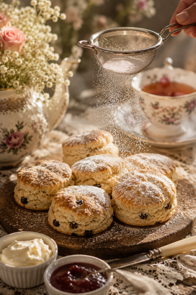
A light dusting of powdered sugar over scones or shortbread, applied with a small sieve right before serving, gives a soft, matte finish that photographs well and signals freshness. Do this as close to serving time as possible — powdered sugar dissolves into anything with moisture within about 20 minutes.
10. Pipe, Don’t Spread
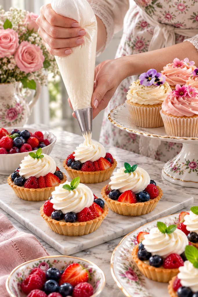
If you’re finishing tarts or cupcakes with cream, jam, or curd, piping through a bag with a simple star or round tip takes barely more time than spreading with a knife but looks considerably more finished. You don’t need decorating experience — a plastic sandwich bag with the corner snipped off works as a makeshift piping bag for a rustic, homemade look that still reads as intentional.
11. Slice Scones on a Diagonal for Display
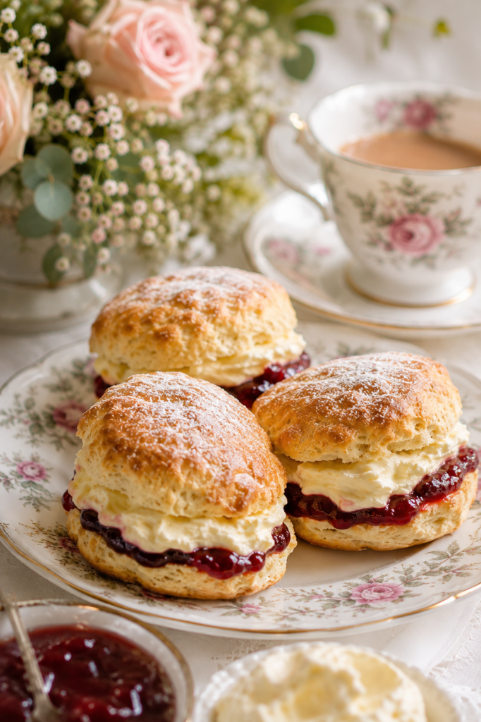
A scone split straight across looks like a biscuit. Split on a slight diagonal and propped so the cut face shows the layers of clotted cream and jam, it looks like it was made for a photograph. This small change in how you plate rather than how you bake makes a real visual difference.
12. Label Everything, Especially for Larger Groups
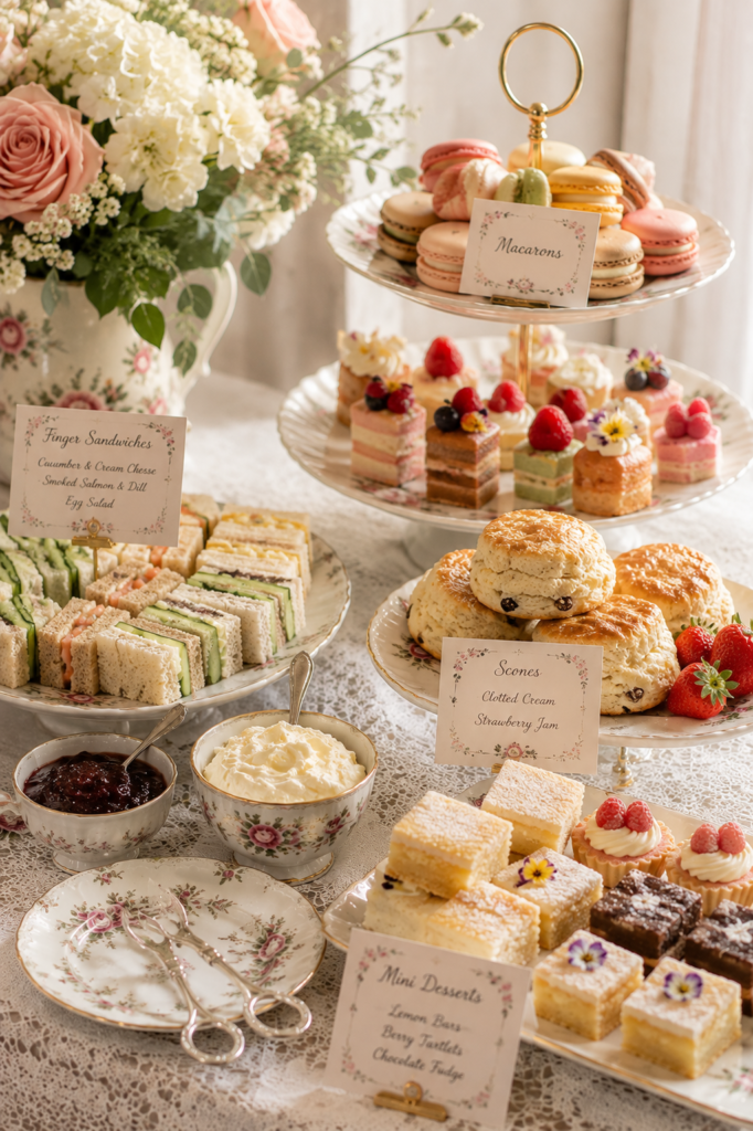
Small handwritten or printed tent cards identifying each item do double duty: they help guests with dietary restrictions self-navigate, and they add a layer of polish that suggests real thought went into the menu. This matters more as guest count grows past six or eight, where not everyone will know what’s on offer.
13. Use a Runner Instead of (or Under) a Full Tablecloth
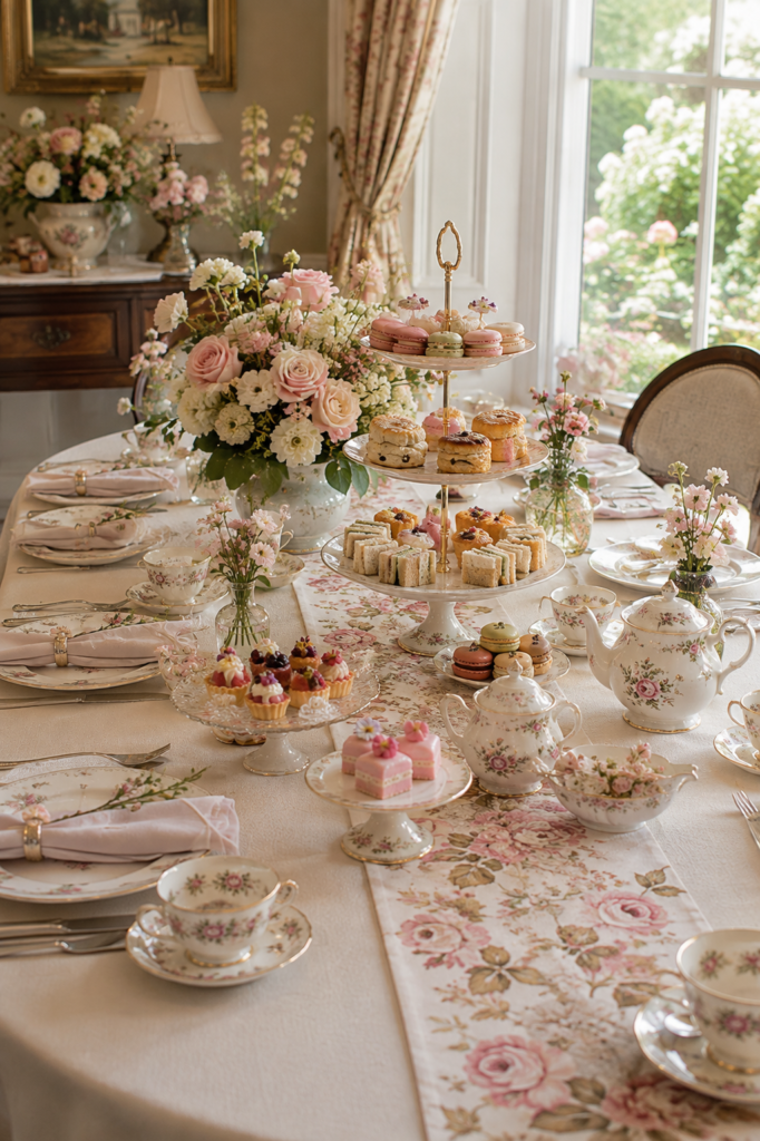
A table runner down the center of a full tablecloth adds texture and a second layer of color without the flatness of a single sheet of fabric. It also gives you a visual “lane” to align your tiered stand and centerpiece along, which makes arranging the rest of the table more intuitive.
14. Vary Texture, Not Just Color
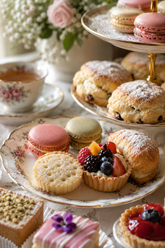
A table of only smooth, glossy items (fondant cakes, glazed tarts) looks flat next to one that mixes textures — a rustic crumbly shortbread next to a glossy macaron next to a matte, sugar-dusted scone. Texture variety does a lot of the visual work that people usually try to solve with more color.
15. Stagger Item Heights Within Each Tier
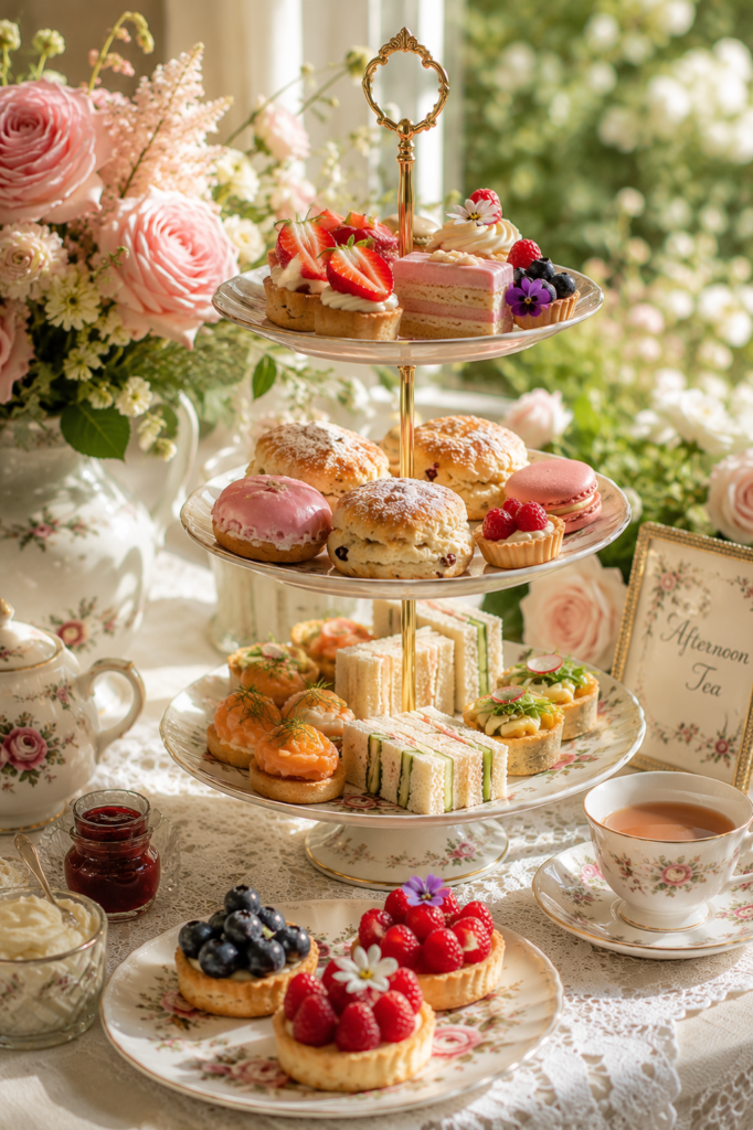
Even within a single tier of a stand, you can create visual interest by propping some items slightly higher than others — a small folded napkin or a cake stand riser underneath a few pieces. It avoids the “everything laid flat in a row” look that reads as a buffet rather than a curated spread.
16. Reserve One Showstopper Item
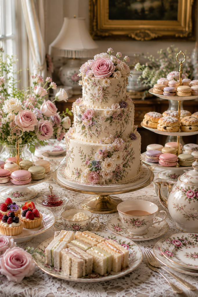
Every table benefits from one item that’s clearly the centerpiece of the food, not just the flowers — an iced layer cake, an elaborate tart, or a dramatic croquembouche if you’re ambitious. Everything else on the table can be simpler because this one piece is doing the visual heavy lifting.
17. Use Clear Glass Sparingly for Contrast
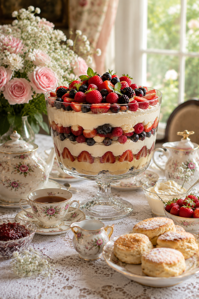
A single clear glass trifle bowl or cake stand among mostly opaque china creates a moment of contrast that draws the eye. Overusing glass, on the other hand, can make a table feel cold. One glass piece is usually enough.
18. Keep Napkins Simple and Let the Food Be the Detail
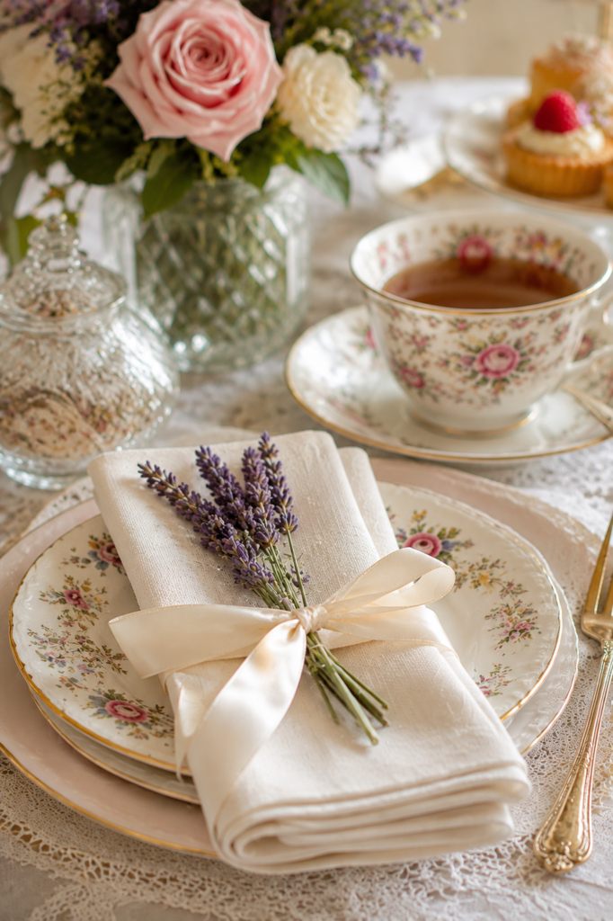
Elaborate napkin folds can compete with food for visual attention. A simple fold with a ribbon, sprig of herb, or single flower tucked in tends to look more current and lets the food remain the focal point of the table.
19. Photograph the Table Before Guests Arrive
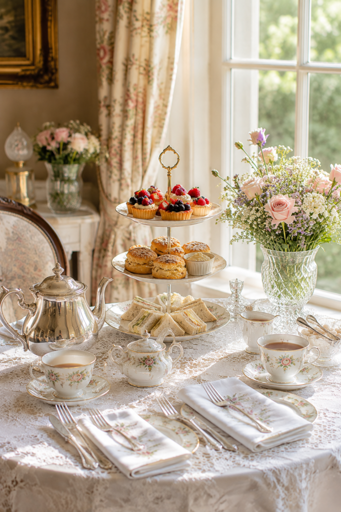
If part of your goal is documenting the spread, take photos before anyone sits down — condensation on glassware, disturbed garnishes, and moved items all happen within minutes of guests arriving. Natural light near a window, rather than overhead lighting, will give you the most accurate colors.
20. Plan for Replenishment Without Losing the Look
For longer parties, decide in advance how you’ll refill trays without the table looking picked-over. Keep backup garnishes ready, and refill in small batches from the back of a tray forward, rather than waiting until a tier is empty. A half-eaten tray refreshed in one motion looks intentional; one refilled item at a time while guests watch looks makeshift.
Frequently Asked Questions
How far in advance can I decorate the table? Non-perishable elements — linens, stands, place cards, dried or silk flowers — can be set the night before. Fresh flowers are best arranged the morning of. Food should be plated as close to serving time as your menu allows, ideally within an hour, since garnishes like powdered sugar and fresh herbs lose their look quickly.
What if I don’t have a tiered stand? Stack plates of different sizes with small risers (upturned bowls, wrapped boxes, or dedicated cake-stand risers) between them. The height effect matters more than the specific hardware.
How many food items do I need per guest? A common guideline for a tea party is 4–6 savory bites and 4–6 sweet bites per person if tea sandwiches and desserts are the whole meal, scaled down if you’re serving a full lunch alongside.
Do edible flowers taste like anything? Most edible flowers used for garnish (violas, pansies) have a very mild, slightly peppery or grassy flavor. They’re chosen primarily for appearance, not flavor impact, so they won’t clash with what they’re garnishing.
What’s the easiest single change that makes the biggest visual difference? Grouping items in odd numbers and adding one low floral arrangement are usually the two changes that make the most noticeable difference for the least effort.